Open Sky Part I

openskyOpen Sky is a book written by Paul Virilio in 1995 about “information technology and the global media.”  One of my first thoughts of this book is how interesting it is that to be written by an artist who originally trained in stained glass art. With in the first few sections of Part I, it is evident that his experience enabled him to write this book.

His book starts off by talking about the difference between real-space and real time. From what I can understand, real-time is what is currently happening in our technologically advancing world where these technologies are creating a new dimension to life in comparison to real-space, where it literally creates dimension by using infrastructure.

imagesMeeting at a distance is talked about as being in here and there at the same time. This is only conceivable in our time with the type of technologies that have come out even in the past five years. My first thought was how easy it is to be at a job interview that is three states over while being in your own home. Things like Skype or FaceTime have made this distance a possibility.

Virilio talks about and defines the importance of space and time. Space and time are literally being defined by our technology and we are the reason for why it’s almost being warped. FaceTime is a great example of how we are doing this. We are closing the distance and completing other tasks at the same time — it’s truly remarkable when looking even at ten years ago.


“The Elements of User Experience”

Jesse James Garett, writer of the book”The Elements of User Experience”, is one of the founders of Adaptive Path which is a user experience consultancy located in San Francisco. For more information on information architecture resources, you can visit his personal website at www.jjg.net.

For today’s reading, I had to read chapters one and two in his book “The Elements of User Experience”. The first chapter, User Experience and Why It Matter, is all about the importance of user experience in the making of products and why it should NOT be overlooked in production. Garett defines user experience as “the experience the product creates for the people who use it in the real world.”

Before leading into user experience and the web, he talks about the importance of not how the product works and if it works, but how the product actually works from the outside. Like he suggests with the buttons, it makes me wonder how many products that I have had or have that work, but not consistently because of the design.

It's not the cat's fault, but the product's poor design.

It’s not the cat’s fault, but the product’s poor design.

User experience on the web, is just as important if not more important that the experience with a product. If someone has good user experience on your site, than that means good business. The content of your site, regardless if you sell anything, is going to get more people to come back to view your site. THIS IS GOOD BUSINESS.

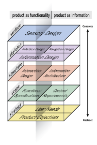
Once you understand the concept of good vs. bad user experience, then you can begin to build a better experience for your users. Chapter 2, Meet the Elements, talking about the decisions that are made in order to make a good user experience. They are as follows:

1. The Surface Plane

2. The Skeleton Plane

3. The Structure Plane

4. The Scope Plane

5. The Strategy Plane

Each of these planes help the website to become the most useful for a user to have that good experience that Garett is talking about and play into all aspects of the design of a good website for users. Elements-of-User-Experience

Aesthetics of Editing

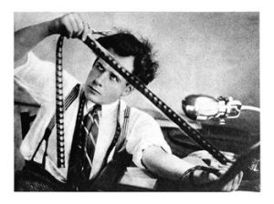
sergei-eisenstein-editing-film-october

Einstein looking at film. I found this picture and it reminded me of what editors/directors might do (except in modern day) in order to tell the story of the movie or TV show.

In Osgood and Hinshaw’s chapter on Visual Storytelling, I literally got a sense of how important treating film and editing like how someone would tell a story. Well duh, is  probably what you are thinking when you think of every movie or TV show that you have ever seen, but I am talking about the cuts and the edits that the director has to make in order to tell that story that we recognize on the big or small screen.

What I enjoyed most about this chapter was the section called ” The Psychology of Editing”. The title may suggest that seems simple enough, but I had never realized how much thought is put into every cut and edit that a director makes while editing. It always just seemed that the script worked itself out and the director cut where he or she wanted to shorten it. A las, this is not the case.

For example, everyone knows about the saying that “a picture is worth a thousand words“, just as these two authors use in this chapter. What this chapter and this section made me think of more specifically is how boring our movies would be without the sounds and the dialogue over the picture. Awful in my opinion, but I guess some had to deal with it at some point!

Osgood and Hinshaw’s goal in this particular section is to portray to the reader just easy it is to change around a shot just by moving the camera to a different angle. editing2600
And it’s all truly a way in playing with the viewer’s emotions, deciding what angle or what cut is the most resonating or eye catching with the audience.

The video projects that we are working on now are only five minutes, but the amount of decisions and we have to make as “directors” or editors will either make or break our videos. This is what Osgood and Hinshaw want us to take away from this section; about how crucial these decisions are and who you should be thinking of when making these decisions.

Forces Within the Screen

Written by Zettl, this article focuses on the importance of being able to fit “the event” inside it’s respective screen whether its a television, computer or motion picture screen.

When talking about “Horizontal and Vertical” planes, there is one section that really grabbed my attention; “Tilting the Horizontal Plane”. Why? because he talks about how we can so easily distinguish a straight line versus something that’s crooked. So what happens when you see this picture of this car?

car

It’s disorienting, isn’t it? I looked at it, and my first reaction was that I tilted my head to “match the tilt”. I reason that I did this subconsciously to try and straighten it even though its physically impossible to do so anymore because the picture has already been taken.

Based on my understanding of the reading, I would say that this tilted horizon is stressed because of the lean towards the camera or, well you as the viewer. This adds an automatic intensity to the picture.

Just look at it compared to this picture of a car where the horizon is straight:

Chevrolet_Camaro_RS_yellow_car

The car is obviously on a track and I am certain that it would probably go just as fast as the one previously mentioned, but there is something that is clearly less intense about the photo and about the car itself. It suddenly makes it obvious as to why add companies use such particular angles when shooting car commercials; they have to get all of that information and feeling within their frame, the screen.

Multimodal Polyphony

Written by Anders Fagerjord, “Multimodal Polyphony” talks about how media has given us the opportunity to combine forms of writing and images all in one place, the internet.

This article examines National Geographic Magazine‘s cover of “The Way West“; a story covered in September, 2000 that was both an online article and a film. The film, is not a standard motion film, but a film of images that come with a story that has been recorded over the images. In this film, Fagerjord talks about how the techniques in this film are writing, images, speech, music and sound effects. All of these together engage the audience with extreme ease

The extreme ease that comes with partaking in such a media, comes with the fact that you dont have to  read anything while listening. It’s simply that the audience has to be watching the pictures and listening at the script that is playing with the images. Static writing is chosen for this type of media for this exact reason

Zen of Listening

You throw a stone into a pond and you’re going to get a ripple effect.

ripple effect

ripple effect

This concept was used by scientists to help people understand how radio waves and signals work. I personally, love this example because it gives everyone a clear image of how exactly something like radio signals operate. Douglas tells us that the stone hits the water   is the same as the radio signal; the ripples are the effect and those represent the radio waves; once the waves (both literally and figuratively, hit the shore that’s the end point or in other words, your radio receiver. Applying this concept with the different concepts of AM and FM radios, helps people try and understand (especially at the time of 1920s through the 1950s and 70s) how word can travel without anything in between visibly connecting the message to the receiver.

The example of the radio and it’s complexities, especially when it was first brought about, is an example of zen listening because it connects people with something that’s not physically there. Listening to the radio is an opportunity for people to connect with themselves or maybe to someone else simply through what is being played on the receiver.

In response to this article, I think it’s interesting how some of the topics that we have discussed prior to this are still applying hear when talking about the radio. The radio was once such a big deal and a way for people to still feel connected. Today, the radio is even beginning to go instinct. At least since I’ve been in college, I have noticed that certain applications such as Spotify have changed the way we listen to music or other things that enhance our feelings.

The Meaning of Composition

Today our reading assignment is on a chapter from Reading Images, written by Gunther Kress and Theo van Leeuwen. “The Meaning of Composition” talks about the importance of not only the representational and interactive elements of an image but of the composition of the whole image.

Composition, as I take it is the glue that keeps the other two elements together. Kress and Leeuwen explain it by saying that composition relate the two elements through interrelated systems:

1. Information values: “the placement of elements endows them with the specific informational values attached to various zones of the image: left and right, top and bottom, centre and margin”

2. Salience: “the elements are made to attract the viewer’s attention to different degrees, as realized by such factors as placement in the foreground or background, relative size, contrasts in tonal value, differences in sharpness, etc.”

3. Framing: “The presence or absence of framing devices disconnects or connects elements of the images, signifying that they belong or do not belong together in some sense.”

These three elements work together so we can have a full understand of the image in whatever context that it may be presented in.

spread-printer-1_1I see a magazine spread as an example of this concept. All of the images and the text work together to create a meaning for the viewer that the viewer can then take and make their own meaning out of.

Just looking at this “Travel & Leisure” page, you see all three elements taking place within this spread. The placement (information) of these images tell the reader which ones are the most important. For example, the one of the restaurant in the top left corner is the largest and placed right at the top of where the article begins. The different sizes (salience) of the photos bring the reader to view the images at different times and in different ways while reading through the article or looking at the rest of the pictures. Lastly, the framing or the images. These images are essentially framing each other, signifying that they all belong together in some aspect.

Dictionary.com defines composition as “the act of combining parts or elements to form a whole; or the resulting state or product.” It’s important to recognize that Kress and van Leeuwen address the importants of this and display it throughout their writing and images used to explain this.

Viewers Make Meaning

Continuing with Sturken and Cartwright, they talk about the viewer and the importance of the placement of the photograph (or any media) in relation to what the viewer is doing. Now I would have said that instead of the viewer, the audience would be a better subject when studying the placement of media, but frankly I was using the wrong terminology and Cartwright and Sturken clear this up immediately.

A viewer is an individual who looks. here-is-one-viewer-checking-them-out


movieaudienceAn audience is a collective of lookers.


There are a few different aspects as to why it’s more important to look at the viewer rather than the audience. They talk about how the viewer reacts; whether or not it’s a personal photo or not, whether or not it’s being viewed in a public or private setting, and the context of the photo altogether. The idea is to move past the concept of interpellation and more into what specifically calls our to an individual viewer rather than trying to mold the viewers views in an audience.

Contrasting this exact point, interpellation can very well be used in order to make the individual viewer feel that the photograph (if in fact it holds a public purpose) is meant for him/her. Advertisements, as described by Cartwirght and Sturken, is a way that this can happen because advertisement companies strategically make the ad feel like it’s for you, even though there are millions of “you’s” seeing the same advertisement.

dovead


This Dove ad, may be a little different from what they are referring too, but I feel as if it applies to this situation. When Dove kicked off this campaign in 2004, I didn’t feel as if it were meant for me at all; I was eleven, and certainly didn’t think of myself as a woman by any means. Although, I did feel that it spoke to me indirectly. I was informed, although not originally mean for my eleven year-old mind, that I should and deserve to treat my skin right. Though not meant for someone my age, but the company was able to even make an eleven year-old think about it in terms of me. This is the meaning that is preferred by the producers but actually created by the viewers.


“Images, Power and Politics”

Maritsa Sturken and Lisa Cartwright propose in chapter one Images, Power, and Politics, pictures hold a lot of power to their audiences.

This is what I took out of this article and I think it’s because this holds very true to me. I get a lot, and I mean A LOT out of pictures and I feel that without them, our world and our connections would be lacking today.

While I feel more that images are a key source in memory, that memory can also be not so good, especially in regards to history. My first encounter with these kinds of photographs that Sturken and Cartwright are talking about, was with 9/11.

9970850-standard

people looking and reacting to the attacks on 9/11

These photos are exactly what these writers are talking about with the power of a photograph, especially with history. This aspect of looking is almost something that we feel bad for doing, but we can’t help but do it. When it comes to events like 9/11 or like the murder scene mentioned in the reading, it’s interesting how the act of looking is always something with violence. Very rarely do we see anymore photographs of people looking at something extremely exciting that’s happy.

We have a history of this, as they state in the article, that we have a “fascination with violence…using images to expose the devastating aspects of violence.”

Another example of this, is one Sturken and Cartwright talk about: the murder of Emmett Till. This terrible story and the images that went along with it, only caused more people to look. The photo represents that troubles that African Americans were still going through and for what, in Emmett’s case, SUPPOSEDLY flirting with a white female. But, we as a hurt and shocked community, being the United States, couldn’t stop looking.

This idea of looking is correlates with representation and how what we put out there as photographs are a representation of the community and even what the community may or should be feeling.

For me, I am guilty of looking, like most of us; which means you could also say that I am guilty of assimilating with society because photographers and journalists put out these photographs that make us look. Whether it was the news or the magazines, I could not stop looking at what had been captured on this dreadful day, and when I first was old enough to hear this story, nothing I did kept me from further investing and looking at the tragic story. This is what kind of power photographs have over us.

Photographs, much like a lot of the digital media has become very political in regards to, a photograph always has something to do with some greater debate going on. This, for me, takes away from my original meaning of a photograph. It’s sad to think that this also is probably only going to increase.

Framed and Mounted

Written by David Rowe, Framed and Mounted: Sport Through the Photographic Eye talks about the importance of capturing those victorious moments that many fans and family adore.

gold medal match for treanor and walsh

gold medal match for treanor and walsh


Tommie Smith and John Carlos 1968 victory in Mexico

Tommie Smith and John Carlos 1968 victory in Mexico


These photos have extreme impact, whether you were there and experienced, or are just seeing for the first time, the ability to capture these moments is truly amazing. The photographer’s job? Well that’s simple, to show the audience exactly what they want to see – the athlete. Rowe states that “the most important object in sports photography is sport’s prime instrument, the human body.” Like I said, this is what all of their fans and family, recruits, etc. want to see: their epic victory or moment captured forever.

This idea of capturing the victory, or maybe loss, is that it is frozen in time. The photographers take hundreds of shots during games in order to get that one shot that that they can edit and eventually be the cover of the newspaper or magazines. Similar to what I discussed last week, it’s still crucial for sports photographers to organize and choose the best photos that illustrate what happened in a particular event. It’s very important that the photograph be representative of not only the game, but of the article that describes the game for people who weren’t there. This can also be hard for some audiences because photographers and the journalists, may have a different view of the game than someone reading the article and viewing the picture. It just means, like a lot of other things, that the reader must find the journalist that portrays the best article and the best image for the game/article.

One thing that Rowe talks about is gender issues in sports photography. He explains that there is this issue of women athletes as being inactive or passive in sports photographs. I understand why he might say this, but couldn’t actually imagine one particular photograph that supports his example. So I came up with a few pictures. Venus Williams and Derek Jeter, both known for their respective sports and their victories, portrayed in here in one very inactive photo and one considered active.


Venus Williams

Venus Williams


Derek Jeter

Derek Jeter


Obviously, we see a difference here. Jeter is clearly more active than Venus is and therefore Rowe’s point is seen as true. BUT what if I post this instead:

Jeter's batting stance

Jeter’s batting stance


This picture, in my opinion, is just as inactive as Venus’. Nothing is happening other than Jeter getting ready for the pitch. So, why is there still so much of a slant when it comes to women athletes? Couldn’t tell you because I’m sure a lot of male athletes would say that their women counterpart is just as good, maybe if not better. Society, still hasn’t parted from the whole concept that apparently men are better than women.

All in all, the sports photograph is not only important to the audience, but it’s important for the athlete who is featured in the photo. It’s purpose is to freeze the moment, whether good or bad, in time forever. Then we can experience that moment and all of the emotions of it over, and over again.