Point of View

John Douglass and Glenn Harnden’s chapter on Point of View was the reading for class this week.

9780545511957_006

In this chapter, they cover three ways to shoot while thinking of perspective. These three ways are POV shots, Perspective of the Storyteller, and Character Point of View.

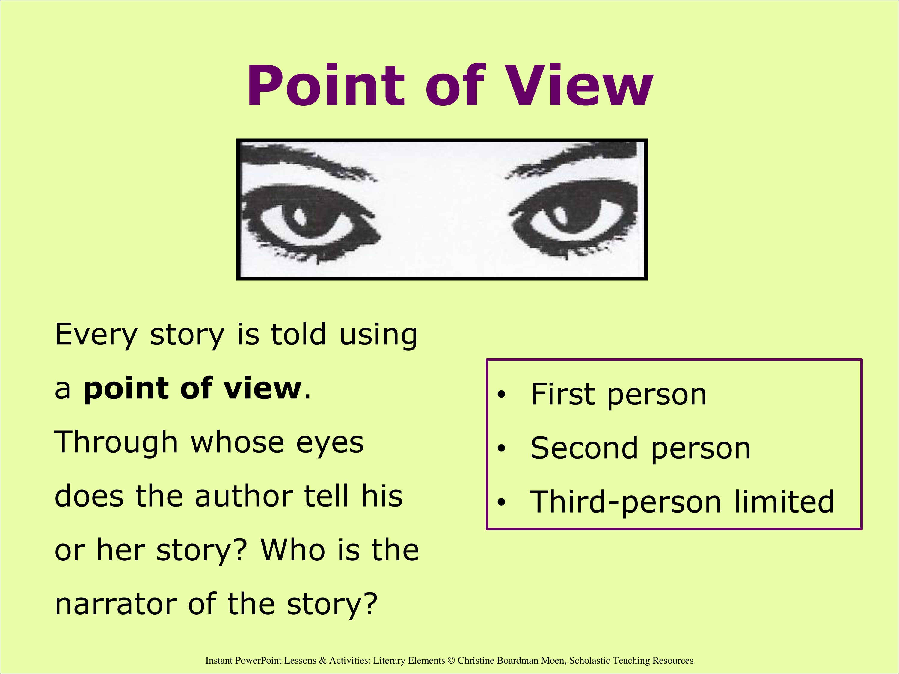
This picture simply portrays exactly what Douglass and Harnden’s objectives were throughout this chapter. Each of these techniques are used for shooting specific scenes or specific genres when talking about film or TV.

For example, POV shots are most commonly seen in horror or dramatic movies. One example is the famous shower scene in Alfred Hitchcock’s Psycho, where the the camera goes back and forth from the shower to the eyes of the “mother” until the “mother” begins to commit the murder and the perspective is all from her point of view.

This particular angle in a film creates the suspense that is so often craved when watching a horror film. In this scene, there is also use of character point of view as well. Quick shots of her doing math at the table, or turning on the shower head are examples of this. Depending on the film, certain shots are more affective on the audience. Documentaries typically use Perspective of the Storyteller, well because that’s exactly what the storyteller is supposed to be doing in a documentary! With that said, it’s important to note that using this technique may be counteractive if used in the wrong setting or for too long, like most of these techniques. The key is to switch it up, but in a way that enhances the plot of the movie, show, etc.

The Meaning of Composition

Today our reading assignment is on a chapter from Reading Images, written by Gunther Kress and Theo van Leeuwen. “The Meaning of Composition” talks about the importance of not only the representational and interactive elements of an image but of the composition of the whole image.

Composition, as I take it is the glue that keeps the other two elements together. Kress and Leeuwen explain it by saying that composition relate the two elements through interrelated systems:

1. Information values: “the placement of elements endows them with the specific informational values attached to various zones of the image: left and right, top and bottom, centre and margin”

2. Salience: “the elements are made to attract the viewer’s attention to different degrees, as realized by such factors as placement in the foreground or background, relative size, contrasts in tonal value, differences in sharpness, etc.”

3. Framing: “The presence or absence of framing devices disconnects or connects elements of the images, signifying that they belong or do not belong together in some sense.”

These three elements work together so we can have a full understand of the image in whatever context that it may be presented in.

spread-printer-1_1I see a magazine spread as an example of this concept. All of the images and the text work together to create a meaning for the viewer that the viewer can then take and make their own meaning out of.

Just looking at this “Travel & Leisure” page, you see all three elements taking place within this spread. The placement (information) of these images tell the reader which ones are the most important. For example, the one of the restaurant in the top left corner is the largest and placed right at the top of where the article begins. The different sizes (salience) of the photos bring the reader to view the images at different times and in different ways while reading through the article or looking at the rest of the pictures. Lastly, the framing or the images. These images are essentially framing each other, signifying that they all belong together in some aspect.

Dictionary.com defines composition as “the act of combining parts or elements to form a whole; or the resulting state or product.” It’s important to recognize that Kress and van Leeuwen address the importants of this and display it throughout their writing and images used to explain this.

Viewers Make Meaning

Continuing with Sturken and Cartwright, they talk about the viewer and the importance of the placement of the photograph (or any media) in relation to what the viewer is doing. Now I would have said that instead of the viewer, the audience would be a better subject when studying the placement of media, but frankly I was using the wrong terminology and Cartwright and Sturken clear this up immediately.

A viewer is an individual who looks. here-is-one-viewer-checking-them-out


movieaudienceAn audience is a collective of lookers.


There are a few different aspects as to why it’s more important to look at the viewer rather than the audience. They talk about how the viewer reacts; whether or not it’s a personal photo or not, whether or not it’s being viewed in a public or private setting, and the context of the photo altogether. The idea is to move past the concept of interpellation and more into what specifically calls our to an individual viewer rather than trying to mold the viewers views in an audience.

Contrasting this exact point, interpellation can very well be used in order to make the individual viewer feel that the photograph (if in fact it holds a public purpose) is meant for him/her. Advertisements, as described by Cartwirght and Sturken, is a way that this can happen because advertisement companies strategically make the ad feel like it’s for you, even though there are millions of “you’s” seeing the same advertisement.

dovead


This Dove ad, may be a little different from what they are referring too, but I feel as if it applies to this situation. When Dove kicked off this campaign in 2004, I didn’t feel as if it were meant for me at all; I was eleven, and certainly didn’t think of myself as a woman by any means. Although, I did feel that it spoke to me indirectly. I was informed, although not originally mean for my eleven year-old mind, that I should and deserve to treat my skin right. Though not meant for someone my age, but the company was able to even make an eleven year-old think about it in terms of me. This is the meaning that is preferred by the producers but actually created by the viewers.


“Images, Power and Politics”

Maritsa Sturken and Lisa Cartwright propose in chapter one Images, Power, and Politics, pictures hold a lot of power to their audiences.

This is what I took out of this article and I think it’s because this holds very true to me. I get a lot, and I mean A LOT out of pictures and I feel that without them, our world and our connections would be lacking today.

While I feel more that images are a key source in memory, that memory can also be not so good, especially in regards to history. My first encounter with these kinds of photographs that Sturken and Cartwright are talking about, was with 9/11.

9970850-standard

people looking and reacting to the attacks on 9/11

These photos are exactly what these writers are talking about with the power of a photograph, especially with history. This aspect of looking is almost something that we feel bad for doing, but we can’t help but do it. When it comes to events like 9/11 or like the murder scene mentioned in the reading, it’s interesting how the act of looking is always something with violence. Very rarely do we see anymore photographs of people looking at something extremely exciting that’s happy.

We have a history of this, as they state in the article, that we have a “fascination with violence…using images to expose the devastating aspects of violence.”

Another example of this, is one Sturken and Cartwright talk about: the murder of Emmett Till. This terrible story and the images that went along with it, only caused more people to look. The photo represents that troubles that African Americans were still going through and for what, in Emmett’s case, SUPPOSEDLY flirting with a white female. But, we as a hurt and shocked community, being the United States, couldn’t stop looking.

This idea of looking is correlates with representation and how what we put out there as photographs are a representation of the community and even what the community may or should be feeling.

For me, I am guilty of looking, like most of us; which means you could also say that I am guilty of assimilating with society because photographers and journalists put out these photographs that make us look. Whether it was the news or the magazines, I could not stop looking at what had been captured on this dreadful day, and when I first was old enough to hear this story, nothing I did kept me from further investing and looking at the tragic story. This is what kind of power photographs have over us.

Photographs, much like a lot of the digital media has become very political in regards to, a photograph always has something to do with some greater debate going on. This, for me, takes away from my original meaning of a photograph. It’s sad to think that this also is probably only going to increase.

Digital Still Photography

Written by Vincent F. Filak and Stephen Quinn Digital Still Photography” is exactly what I’ve been waiting for; and a little more than I had expected.

First off, let me admit by saying that I had no idea how early the camera was invented. Robert Fenton lugged his “equipment” (I’d said it was more like a trailer) around to capture the war in 1855. I was aware that the camera was invented early on, but I was thinking more like the middle of the 20th century. That’s pretty cool.

It’s amazing how far the technology has come in order to make it more feasible and realistic for us to take photographs. Today it is incredibly easy for photojournalists to capture events such as wars. I feel this way about a lot of our technology today, and it is truly amazing how far all of the cameras, phones, blogging, etc. programs have come. On top of all the improvement, we use them today with such ease.

Filak and Quinn talk about the importance of “ethical standards” that photojournalists should follow while talking photographs of any major event, especially photographs for news. Their point being that the photographs that they capture should be true and real to what is happening in the news report of story. With this said, W. Eugene Smith talks about how he once manipulated a photograph by blending the images together in order to portray an image that reflected what he thought was the truth. This is where photojournalists can get into trouble because their job is to portray what actually happened, not what you think happened.

When comparing the importance of ethical standards to news stories is not the same. Why? Well this is because most news stories, or at least the interviews are all taped and done before the news story actually appears infront of an audience. Therefore they have the power to manipulate the stories or interviews in a way that makes it more appealing to the audience or to what they feel like is the truth. This is what editing can do for videos, good or bad, but if done for reasons other than the true truth, it should make us wonder how many fake news stories we have seen.

Organization and planning is important in my life, and I find that it can be applied to many jobs out there. Photographers and photojournalists have to be able to organize and plan shots that may be most beneficial for a news story, magazine article or whatever it may be. They can do this planning by creating a story board as a guide while actually shooting still images or catching something on tape. This idea is very similar if not the same as one that is created for movies or even comic books.

This is an example of a comic storyboard

This is an example of a comic storyboard


This example portrays what is needed by photographers before a project. Its purpose is to help plan and strategize what is needed before they begin shooting so time isn’t wasted.

It’s important to also note something that Filak and Quinn talk about when using these storyboard techniques to benefit them; “sometimes an excellent picture will not make the final cut because it is redundant or there is another lesser picture that makes the whole stronger.”

This is crucial to remember when putting together photographs for a project because their will always be a “strongest” picture, but sometimes that picture is not the best for the project whether it be for a stream of pictures on a news site or in a newspaper article.

Planning out the photographs is critical because its the order and the story that it is told, and this is something that has clearly been consistent as the technology changes to actually take them.